Values and Value Grouping - 01
Saturday 22 January, 2022
The full extent of the role values play in creating believable paintings cannot be overstated. They are, without contest, the most important element in conveying solidity and atmosphere in a painting.
One simple way to see just how important they are is to isolate them out, as you can see in the image below.
On the left, I have isolated the value qualities and erased the colour information. Note that, while some of the flavour of the image has been lost, the image is still understandable, with easy to read forms.
The right, (where the colour has been isolated), is a whole different story. While the ghost of an image remains, the image has almost entirely broken without the value structure to hold it up!

Naturally, therefore, value design should be the first port of call when learning about the complexities of colour and any student would benefit from a close study of it.
However, when we approach this study we are quickly confronted with how difficult this can be to get right. We are always confronted with an infinite variety of values and the complexity of this can sometimes get overwhelming.
Beyond this complexity, our eyes even lie to us. We are subject to a number of illusions that wreak havoc on our ability to observe accurately. See the illusion below. It may be hard to believe, but these two squares are exactly the same value. Feel free to check for yourself! This particular illusion is called ‘Simultaneous Contrast’, the square in the light is surrounded by lighter squares and so appears darker, the square in shadow is surrounded by light so appears lighter.

With all of these difficulties piling up, it is no wonder we have trouble recreating these values in paintings! How can we approach dealing with all these problems?!
One way that artists can approach dealing with this difficult problem is to simplify the myriad of available values into 3 to 5 clear groups. Once we have simplified the values in this way we are free to focus the rest of our attention on the variety of edge transitions between these shapes. A surprisingly high level of finish can be achieved this way.
We can see an extremely clear example of this in this wonderful drawing by Thomas Eakins (seen below).

Note how through this extremely simple use of values the artist has achieved an incredibly powerful sense of readability and form. Somewhat counter-intuitively, when we look for this strong, simple statement in our values we will often gain much more than we lose.
When we take a look at a more complex work by the same artist, seen below, you may be forgiven for thinking it to be much more complex as it has the addition of colour. However, even in something appearing as naturalistic as this, the same value grouping is occurring. The easiest way to see this is to squint, how many value groups can you see?

This deliberate simplifying and separating of value groups was not unique to Thomas Eakins. In fact, it has been an extremely prevalent idea within academic art for an extremely long time. One place that we can see it clearly within the famous Charles Bargue drawing course. Note in the Bargue drawing (seen below) the clarity with which these values have been articulated.

One interesting idea about this grouping of values that many people do not realise, is that beyond simply being an effective compositional tool, this grouping of values is actually always present as it is a consequence of the way that light presents itself on form.
If we take a look at this planar form (seen below) lit from a point light source. We can see that, although every individual plane has its own value, if we take a broader look (try squinting) we can see just how close together these values are in the different areas of the form. This is due to the accelerating nature for light fall off and is a wonderful effect to strive for in all of our work.

One fantastic way to begin to study this concept of value grouping, and the first step in learning how to apply it to our own work is through a simple 3 value master copy exercise. This is where we deliberately limit ourselves to 3 black and white values to represent an entire painting with hard graphic edges. This may seem difficult at first but it allows us to get to this core value structure, and it is an extremely effective way to awaken this core understanding in our work.
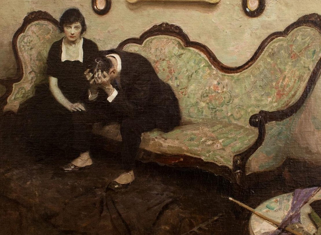
Seen below is one of these copies that I created of the wonderful painting ‘It is hard to explain murder’ by Dean Cornwell. Try it out yourself! Happy painting!

-----------------------------------------------------------------------------------------------------